
Imagine walking into a space where warm terracotta walls meet soft cream textiles, dotted with splashes of cobalt and gold. That’s the magic of the boho color palette—a blend of earthy boho colors and vibrant boho hues that feel both familiar and adventurous. Whether you’re styling a living room or choosing an outfit, bohemian design invites you to embrace imperfection and tell a story through color.
From global textiles to desert landscapes, the boho aesthetic draws from nature’s textures and cultures worldwide. Its popularity today reflects a longing for authenticity in a fast-paced world. This guide shows how to mix muted neutrals like sage green and warm browns with bold accents to create spaces and styles that feel personal yet cohesive.
The boho color palette isn’t just a trend—it’s a way to make your environment reflect your journey. Discover how earthy tones anchor while vibrant hues add energy, all while staying true to your unique style.
Key Takeaways
- Boho design balances earthy neutrals and bold accents for inviting spaces.
- Earthy boho colors like terracotta and sage ground vibrant hues such as turquoise or mustard.
- Cultural influences and natural elements shape the boho color palette’s timeless appeal.
- Layering colors and textures creates depth without overwhelming a room or outfit.
- Bohemian style emphasizes personal expression over rigid rules, making it accessible to all.
Understanding the Bohemian Aesthetic: Origins and Philosophy
Bohemian style emerged from a blend of artistic rebellion and global cultural exchange. Its roots trace back to 19th-century Europe, where marginalized artists embraced a nomadic lifestyle and rejected societal norms. This ethos evolved into the bohemian aesthetic we recognize today, celebrated for its fusion of creativity and freedom.
The Cultural Roots of Bohemian Style
Early bohemian thinkers drew inspiration from Romani traditions and colonial-era exchanges. By the 1960s, the hippie movement amplified these ideas, blending psychedelic art with boho color palette experimentation. Global textiles and indigenous patterns became core elements of this evolving design language.
Free-Spirited Design Principles
- Individuality first: Rejecting mass-produced trends in favor of personalized decor
- Multicultural fusion: Mixing patterns and motifs from diverse global cultures
- Sustainable ethos: Prioritizing vintage pieces and natural materials
- Layered storytelling: Telling personal narratives through collected items
Evolution of Boho Through the Decades
| Decade | Key Developments |
|---|---|
| 1960s | Floral prints and tie-dye dominate |
| 1970s | Rustic materials like jute and macramé gain popularity |
| 2020s | Digital nomad influences combine with eco-conscious materials |
Today’s bohemian aesthetic remains a living tradition, adapting global trends while preserving its core values of authenticity and self-expression.
The Essential Components of a Boho Color Palette
Bohemian colors thrive on balance between grounding tones and expressive accents. The boho color palette relies on four core categories: warm neutrals, earth tones, jewel tones, and muted pastels. These groups form the backbone of any authentic bohemian design.
Warm neutrals like cream (#FFFDD0), sand (#F5DEB3), and clay (#E29578) create a neutral base. Earth tones such as sage green (#D4D535), rust (#9C3549), and terracotta (#EC7063) add organic depth. Jewel tones—sapphire (#0F52BA), emerald (#50C878), and amethyst (#9B59B6)—provide bold focal points. Muted pastels like blush (#FFB5C5) and lavender (#C4A7E7) soften spaces without overwhelming.

These colors work together to evoke both comfort and adventure. Warm neutrals stabilize spaces, while earth tones connect to nature. Jewel tones spark joy, and pastels add delicate contrast. This mix mirrors the boho philosophy of harmony between simplicity and creativity.
Key codes like #FFDEAD for golden sand or #8B4513 for rich sepia help recreate the look. Layering fabrics in these shades amplifies texture and dimension. Avoid clashing by pairing bold jewel tones with neutral backgrounds. This balance ensures spaces feel energized yet inviting—a hallmark of true bohemian style.
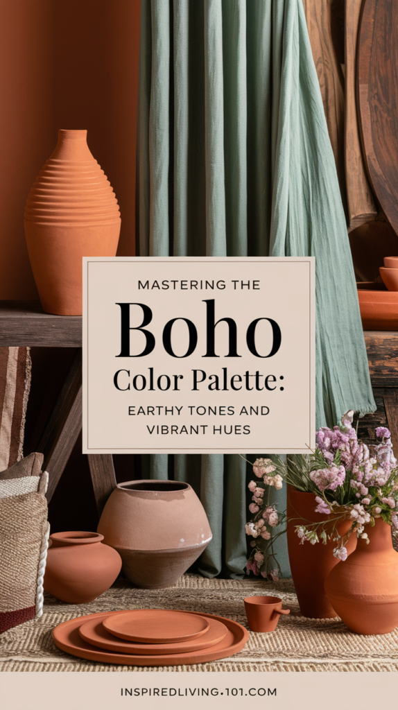
Earthy Boho Colors: The Foundation of Bohemian Design
Earthy boho colors anchor the boho color palette, blending nature’s warmth into every space. These hues draw inspiration from landscapes and natural materials, creating cohesive backdrops for vibrant accents. Whether in textiles, walls, or decor, they evoke a grounded, authentic vibe.
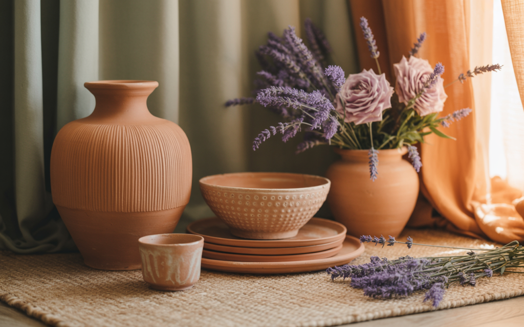
Terracotta and Clay Tones
Rich terracotta and clay shades mimic sun-baked pottery and adobe structures. These orange-browns add warmth to walls or ceramics, pairing well with neutral bases. For example, a terracotta vase or painted accent wall introduces artisanal charm without overwhelming a room.
Warm Browns and Neutrals
Warm browns—from coffee to caramel—form the neutral base of most boho spaces. Natural wood furniture, jute rugs, and woven baskets incorporate these tones. Layering these materials adds texture while maintaining balance. Tip: Mix light and dark browns for depth.
Sage and Olive Greens
Sage and olive greens mimic forest and desert foliage. Use them in upholstery, paint, or plants to connect interiors to the outdoors. A sage-green sofa or olive curtains can anchor a room, acting as a canvas for brighter boho accents like gold or turquoise.
Desert-Inspired Shades
Desert hues like sandstone, beige, and soft taupe mirror arid landscapes. These muted tones work in wall paint, linen fabrics, or stone decor. Pair them with woven textiles or metallic accents to mimic sunlit dunes and ancient terracotta pottery.
These colors create harmony when paired thoughtfully. Start with one dominant earthy shade, then layer complementary textures and subtle contrasts. The result? A space that feels both timeless and effortlessly chic.
Vibrant Boho Hues: Adding Life to Your Spaces
Bohemian style thrives on contrast, and vibrant boho hues are key to injecting energy into any room. These bold shades act as dynamic accents against neutral foundations. Think emerald green throw pillows, sapphire blue ceramic vases, or amethyst purple curtains—each adds a pop of life without clashing with the boho color palette’s earthy base.
Global textile traditions inspire many of these hues. Marigold yellow and burnt orange echo Moroccan markets, while coral and fuchsia mirror Indian block prints. To avoid overwhelm, focus on one or two vibrant shades per room. Use them in textiles like kilim rugs, embroidered tapestries, or handcrafted pottery. For example, a coral-hued bench beside a sage-green sofa creates a sunlit Mediterranean vibe.
- Emerald, sapphire, amethyst: Jewel tones for timeless elegance
- Marigold, burnt orange: Warmth from Middle Eastern and Indian patterns
- Coral, fuchsia: Tropical and artisanal-inspired accents

Balance is critical. Pair bold colors with natural materials like jute, linen, or terracotta. Start with small items: a ruby-red throw over a neutral sofa, or a turquoise accent chair in a neutral-toned living area. Layering these vibrant boho hues through decor ensures spaces feel lively yet harmonious. Remember, less is more—let one bold piece anchor the room’s visual narrative.
“Boho isn’t about rules—it’s about feeling alive through color.” – Interior designer Lila Marquez
Undertones matter. Warm reds pair best with terracotta walls; cool blues complement slate grays. Test hues in natural light to ensure they complement existing neutrals. Whether aiming for a Moroccan-inspired lounge or a Provencal-inspired bedroom, vibrant boho hues transform spaces into expressive, soulful havens.
Creating Harmony: How to Balance Bold and Neutral Elements
Bohemian style thrives on contrast, but balancing earthy boho colors and vibrant boho hues requires intentional planning. Follow these strategies to merge drama and calm without sacrificing cohesion in your boho color palette.
Start with the 60-30-10 rule: allocate 60% of your space to earthy neutrals like terracotta or sage, 30% to mid-tone accents, and 10% to bold vibrant boho hues. This framework prevents overwhelming spaces while honoring bohemian’s eclectic spirit.
- Layer strategically: Stack textures—like woven baskets atop patterned rugs—to add depth without clashing tones.
- Anchor with neutrals: Use warm browns as a foundation to ground pops of cobalt or tangerine.
Transitioning between zones in open layouts? Use neutral fabrics like jute area rugs or linen drapes to bridge contrasting color zones. A transitional pillow collection in gradient shades can soften abrupt shifts between vibrant boho hues and muted tones.
“Balance is the soul of boho design—it’s about letting bold colors sing while keeping the room’s rhythm steady.”
Experiment with gradient wall art or striped throws that blend two adjacent hues. This subtle progression keeps the boho color palette lively yet harmonious. Avoid abrupt color jumps to maintain visual flow.
Seasonal Adaptations of the Boho Color Palette
Boho style thrives on adaptability. Updating your boho color palette with seasonal shifts keeps spaces fresh without demanding full overhauls. These tweaks maintain the core bohemian vibe while responding to the mood of each season.

Summer calls for lightness. Soft whites, pale blues, and bleached woods mimic sunlit landscapes. Layer sheer fabrics like linen or cotton to enhance airy vibes. Try these summer essentials:
- Pale terracotta for warmth without heaviness
- Seafoam green accents
- Woven rattan furniture
Fall’s palette deepens into rich, warm tones. Introduce rust, burnt orange, and deep golds through textiles and decor. Add:
- Handwoven baskets in natural jute
- Velvet throws in amber hues
- Earthenware pottery
Winter boho leans into drama with charcoal bases and metallic accents. Pair deep indigo or forest greens with:
- Silver or gold embroidered cushions
- Dark wood accents
- Velvet in emerald or burgundy
Spring renews with pastels and floral motifs. Soft mint, blush pink, and buttery yellows revive spaces. Incorporate:
- Crocheted throws in pastels
- Botanical wall art
- Earthenware vases with fresh blooms
Room-by-Room Guide to Implementing Boho Colors
Transform every space with room-specific bohemian colors tailored to function and mood. Start with the living area: blend warm neutrals like terracotta and sage greens as walls, then layer in patterned rugs and textiles in jewel tones. 
In bedrooms, prioritize restful hues. Soft ochre or muted indigos create calming backdrops. Add depth with embroidered throws or velvet pillows in the boho color palette. Avoid overwhelming patterns here—let textiles anchor the look without overwhelming the space.
Kitchens thrive with subtle accents. Use subway tiles in cream or sandstone for backsplashes. Brighten cabinets with a pop of cobalt or mustard on cabinet fronts. Mix metallics like brass or copper to mirror the bohemian love for eclectic textures.
Bathrooms can embrace earthy tones without sacrificing cleanliness. Try a terracotta accent wall paired with white subway tiles. Add woven baskets or clay planters to reinforce the natural vibe. Warm wood vanities ground the space while keeping it light.
Home offices need a balance of stimulation and calm. Apply soft ochre walls, then introduce a vibrant area rug or patterned chair. Layer in potted plants and macramé hangings to maintain the bohemian spirit without distraction.
- Living rooms: Earthy walls + bold textiles
- Bedrooms: Muted neutrals + embroidered accents
- Kitchens: Subtle pops of color on functional surfaces
- Bathrooms: Terracotta accents with natural textures
- Offices: Patterned rugs paired with plant life
Boho Color Palette in Fashion and Personal Style
Bohemian fashion thrives on blending earthy neutrals with bold accents, creating looks that feel both grounded and free-spirited. The boho color palette transitions seamlessly from home decor to wardrobe choices, using the same timeless hues that define the aesthetic. From flowing dresses to layered accessories, these hues transform personal style into a reflection of bohemian philosophy.
Bohemian Wardrobe Essentials
Start with foundational pieces in the bohemian fashion colors like terracotta, sage, and warm browns. Opt for natural fabrics such as linen or cotton in neutral tones. Brands like Free People and Eileen Fisher offer versatile options, pairing earthy basics with intricate global-inspired patterns.
Accessorizing with Boho Colors
- Layer gold or silver jewelry to highlight desert-inspired shades.
- Wrap a silk scarf in cobalt or mustard around the neck or wrist.
- Choose woven baskets or embroidered handbags in muted tones.
Creating Signature Combinations
Mix 70% neutrals with 30% vibrant accents—like pairing a camel coat with a cobalt-blue tunic. For bold statements, combine two brights from the boho color palette, such as burnt orange and emerald. Transition seasons by swapping textures while keeping core hues consistent.
Common Mistakes to Avoid When Working with Bohemian Colors
Bohemian design thrives on creativity but requires balance. Many beginners make bohemian design mistakes that disrupt the harmony of the boho color palette. Here’s how to steer clear of these pitfalls:
- Overcomplicating the Palette: Too many hues create chaos. Stick to 3-4 core colors, adding accents sparingly.
- Neglecting Color Temperature: Mix warm terracottas with cool grays thoughtfully. Clashing undertones ruin cohesion.
- Ignoring Texture: Smooth fabrics and rough ceramics interact with light, deepening color impact. Without texture, even perfect colors feel flat.

“Texture is the unsung hero of bohemian spaces—it turns colors from mere paint into a living story.”
Begin with a neutral base like ivory or sandstone. Layer in patterned rugs, woven baskets, and metallic accents. Test combinations using small samples before full-scale application. A 60-30-10 rule helps prioritize dominant neutrals, secondary tones, and bold accents.
Remember: less is more. Let each element earn its place. Fixing mistakes early prevents costly overhauls later. Start simple, then add complexity with intention.
Complementary Design Elements for Your Boho Color Scheme
Nature-inspired materials anchor the bohemian design elements that elevate a boho color palette. Use raw textures like reclaimed wood, handwoven rattan furniture, and terracotta pots to ground spaces in earthy authenticity. These materials add tactile contrast to muted or vibrant hues.

- Textile layering: Mix global patterns like ikat throws, mudcloth wall hangings, and kilim rugs. Overlapping textures unify colors without clashing.
- Living elements: Potted fiddle-leaf figs and trailing pothos plants bring dynamic green tones that complement terracotta and sage shades.
- Lighting: Brass pendant lamps and beeswax candles cast warm glows that enhance earth tones. Avoid LED strips; choose layered lighting for depth.
Handcrafted decor items like macramé wall art or ceramic vases add intentional imperfections. Mix vintage finds with modern pieces to create the collectedible aesthetic central to bohemian style. Woven jute rugs under reclaimed wood coffee tables create cohesive connections between colors and materials.
“The best bohemian spaces balance 70% natural materials with 30% patterned textiles,” advises interior designer Clara Voss. “This ratio maintains harmony while celebrating color.”
Accessorize with metallic accents in oxidized brass or copper to highlight neutral bases. Every piece should tell a story—think embroidered textiles from Morocco or hand-painted ceramics from Mexico. This intentional curation deepens the narrative of your color scheme.
Conclusion: Embracing the Free-Spirited Nature of Boho Colors
Bohemian design thrives on balance between earthy boho colors and vibrant boho hues. The boho color palette celebrates harmony between grounded neutrals like terracotta and sage greens and bold accents that add energy. This style isn’t about rules—it’s about personal expression. Start with shades that feel authentic, whether a warm brown sofa or a throw pillow in rich olive. Layer textures like woven rugs or metallic accents to deepen the look.
Successful boho spaces reflect individuality. Let your experiences and preferences guide choices, whether leaning into summer’s light tones or winter’s dramatic contrasts. Experiment with small elements first, like a patterned throw or ceramic vase, then expand as confidence grows. Trust instincts when pairing colors; there’s no wrong approach as long as the result feels true to your taste.
The essence of bohemian style lies in storytelling through color and texture. Every piece, from a handcrafted vase to a vintage tapestry, contributes to a narrative of creativity and freedom. Let the boho color palette evolve naturally, embracing imperfections and unexpected combinations. Authenticity and joy are the true measures of success in this ever-evolving aesthetic.

